Im taking some inspiration from the thread Show and Tell but in this case from a Groov View perspective. In the past I have posted some strange or confusing topics, but as most newbies are, I am still learning best practices when handling Opto components. However, one thing I am trained in and quite familiar with is design. From font to color and the human side of HMIs we sometimes over look the impact that design has on our products and are preoccupied by ensuring things work efficiently and safely. While a solid strategy and well constructed system is the most important aspect of our jobs, more often than not the customers first opinion on our product is the way that it looks and the way they interact with it. Is it easy to understand? Navigate? Is the appropriate information apparent or easily accessible? I have done some extensive testing to see if I can make our HMIs a natural piece of the system and ease the users transition of learning a new interface. To some this may be a waste of time or unnecessary work. But, I have found in my few years of working in this industry that if I take a bit of extra care on this front, it can not only save the customer a lot of time and frustration but it also minimizes user error and thus minimizes the potential for hazardous situations in the field, it also has the added bones of making our product look more appealing to the onlooker. So here are just a few of the methods I use to build a clean and user friendly Groov application. Im interested to see your projects and how others have used the tools that we have in our gadget palette. So show us what you got!
The first thing that I focus on is the monitor or screen that the user will have. No two screens are alike; color, brightness, and latency all play a roll in the way we interact with technology. So I typically get my hands on one of those screens and set it up so I can see how the project looks with the customers hardware. Once I have this set up I can test my project in multiple environments to see how things change with different lighting and in different configurations. What may look clean and clear at your desk under LEDs when your 2’ away from the screen will not look as intended when youre under a blistering sun 6’ away and rushing to get a glance to see if a component is still in good standing.
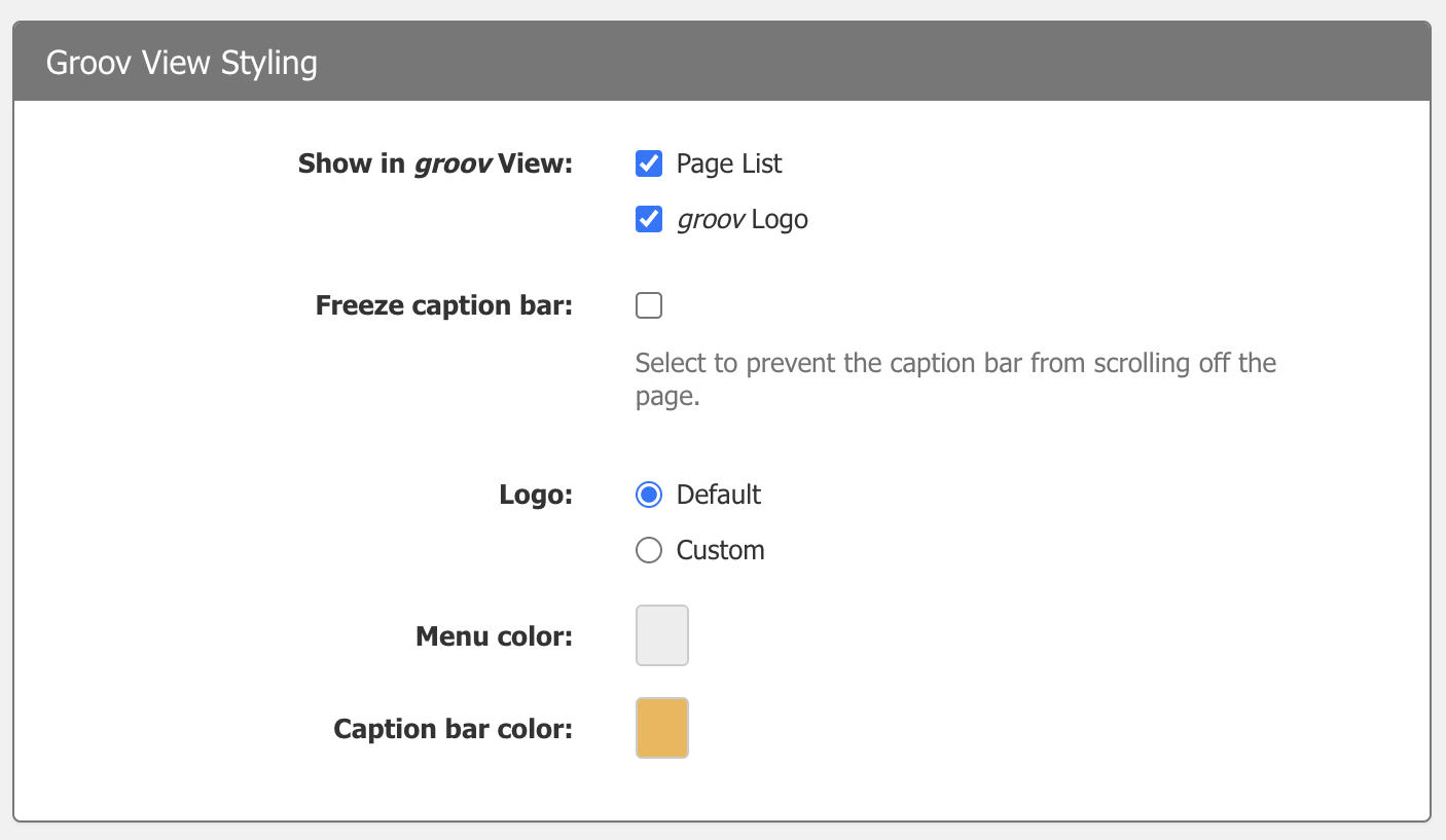
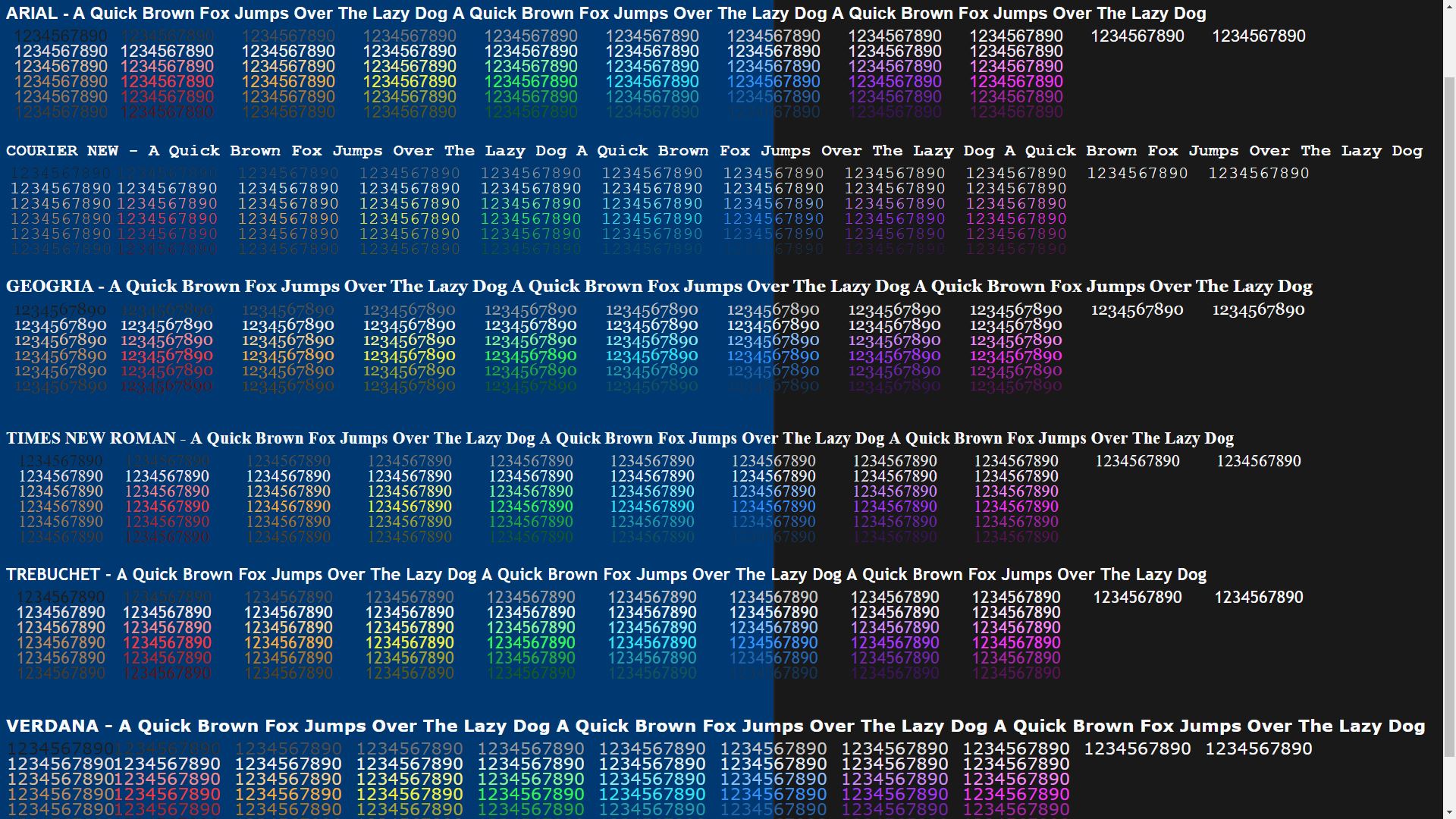
Starting with the background color, whether I choose it or the customer has requested a particular palette it does not matter, I want to ensure that every pixel is legible no matter the environment the customer is in. So I use this formatting page to help me get an idea of which colors, fonts, and sizes to use for the project.
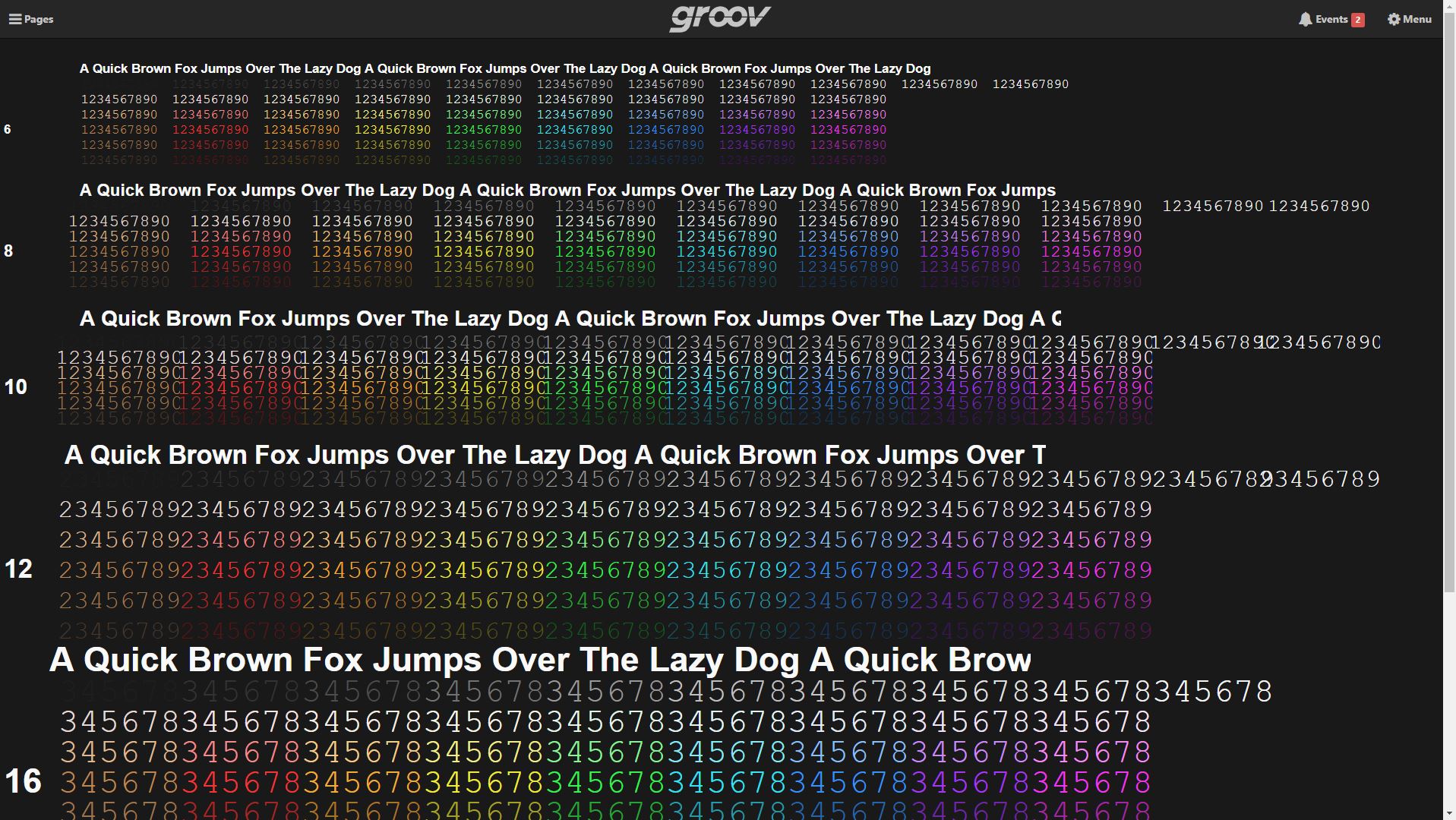
This page allows me to do a few things. I can now change the background color to see which hues are best seen at different distances, different screen brightness, different screen angles and different ambient lightning environments. Here is a good example of what I mean by that - with different background colors, different fonts, and different font colors, there is a slight change in perception and clarity from a distance. You can try it yourself by opening both images, blow it up to full screen, and take a good step back to see how much you can see. Now of course, if the background color and the font color are similar they will be more difficult to distinguish compared to their adjacent examples. But the font style also contributes to this. You can tell that the darker blues of the Arial and Verdana fonts are a quite a bit more clear than Courier and TNR. Another reason why I use this technique is to get a feel for the way the entire page works together. The picture below, when viewed on the customers monitor looks a little too similar to the legendary “Blue Screen of Death” on Windows machines, which to me is something I want to avoid. As well on this monitor, there is also quite a bit of eye strain when viewing this page with this particular background color. No need to make the HMI experience a painful one for the user, so I will stick to the original “Deep Grey”
Now because they are all Text Box gadgets I can also highlight all objects, and change the font styling to see what they look like under the same testing conditions as above. Each project and each customer requires something different so this is a handy means of building a project wide format that suits the scope of the job. In this case I have chosen the "Deep Grey " background because it does a good job showcasing the brilliance of the preset palette for text. Finally on this page it helps me to visualize the way different fonts work together. I typically pick two different fonts, one for headers and titles, the other for values and conditions. This creates a visually appealing page as well as helps customers to quickly find any item theyre looking for. Ive chosen Arial for headers and titles and Courier New for my values.
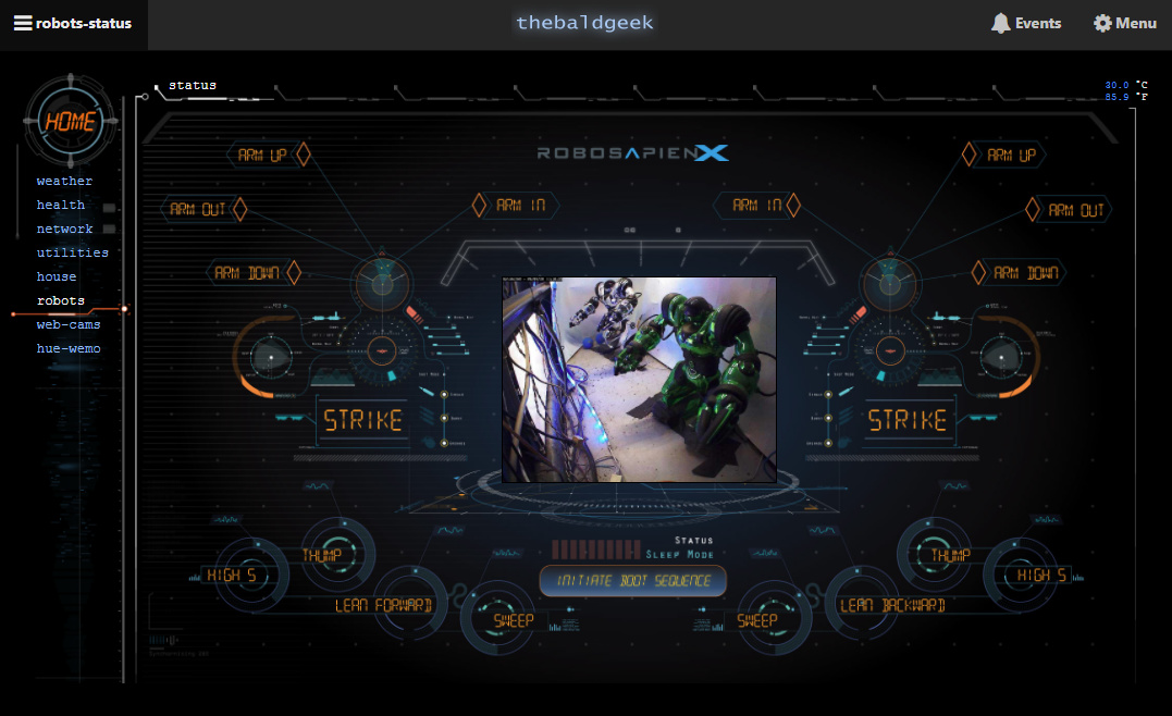
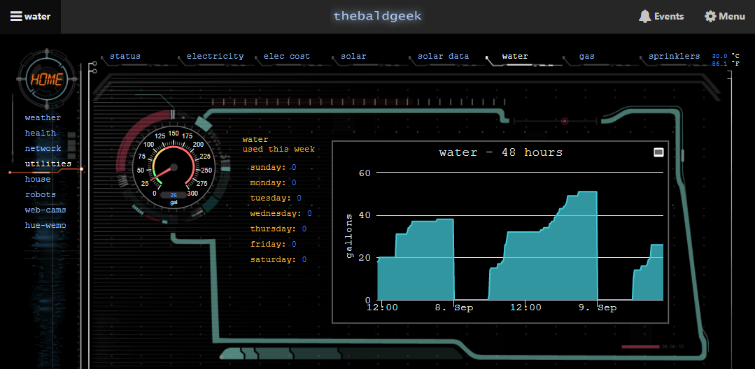
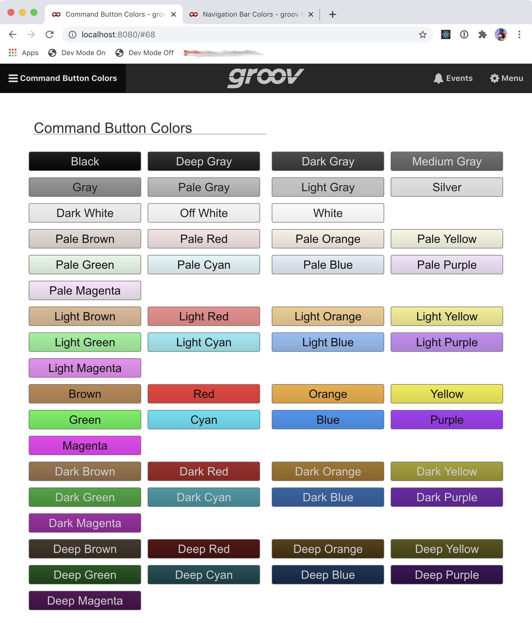
Once I have decided on a background color, fonts, sizes, and colors. I can move on to the next formatting page. With the introduction to an RGB picker for some of the gadgets I also want to ensure continuity for color across the project. So I have chosen a particular band of color from the picture above that best fits my visual goal, took a screen shot of that color band and found the “average” hex code for each color. I have also brought in an Image object for our company logo as well as the customers. I end up with this page.
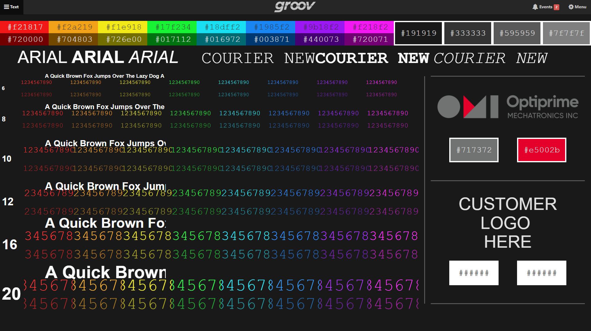
So now I can quickly see all the hex codes for all colors I will be using, different font styles and sizes as well as get some inspiration from the customers logo in hopes to add a little bit of a unique flair personal to them. This is my formatting reference for the rest of the project. I am going to be allotting different colors to represent particular values and conditions so again, there is continuity across the project. If I choose #704803 to represent a particular value type (say an ammeter reading) across all pages then over time the customer will establish a subconscious seeking for that color when looking for that value type. Obviously this can be difficult if you have many different value types but there are also many different ways you can implement this method, the idea is to create a recognizable pattern for the customer to pick up on.
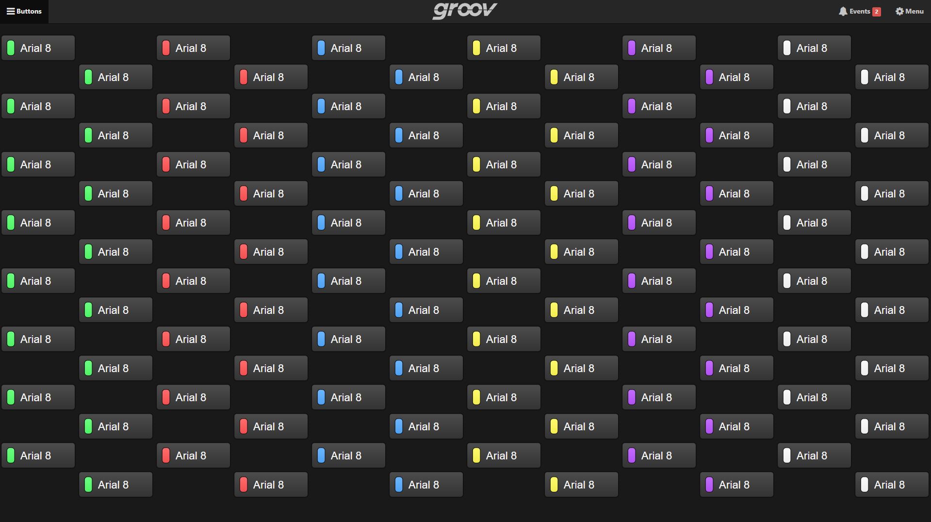
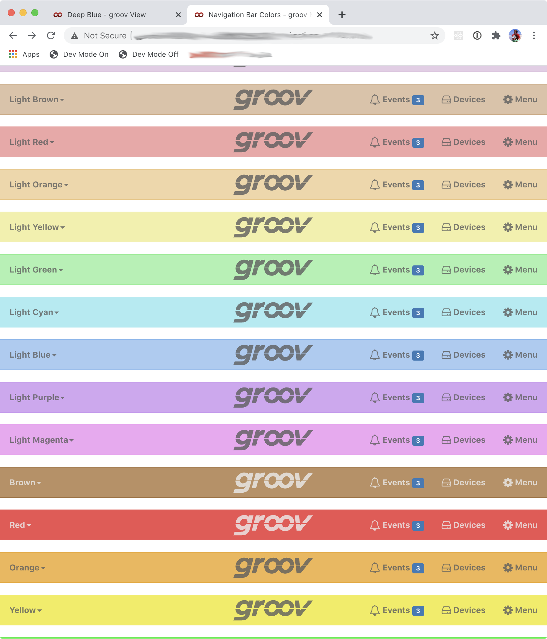
Without filling this post with a lot of pictures, the last couple methods I use to try and create user friendly continuity are; 1 - use the Line Gadget to build my own custom grid. This allows me to build a workspace that include bleed edges (especially if you dont want your page to have that scroll bar / dont want the user to have to scroll), creates a quick reference for objects that are in the same position from page to page (a “Back” button for example), just like when youre using your phone or driving most of us usually learn commonly used interaction points to the extent that it becomes second nature to use that function without looking or even thinking about it, the grid also creates a quick way to line gadgets up so that there is a sense of symmetry without having to count squares. 2 - Following a similar vein as my text format page, I do the same thing with the different types of gadgets I will be using. The “Button” gadget is the most fun to do this with, you can find out how many fit on a screen, a color schedule for the LED condition, sizing, etc. Im putting this picture in here just because I think it looks cool and has helped me quite a bit when considering the size of the button itself.
3 - Finally, I am also constantly bringing in co-workers, particularly ones who are not interested in design, to get an unbiased opinion of which formats are generally the most approachable and easy to interact with. I sometimes find myself getting invested into my own creative direction and its good to have another perspective so that I dont work the HMI into a sterile box, I want to create an inviting experience and dont want the user to think it a chore to work with our product.
Im not sure if this useful to anyone but I find it interesting and wanted to share it with others. What are you doing with your Groov View projects? Do you build a single format and replicate them across your product line? Do you let the customer customize the HMI to their hearts content? Post something your proud of!