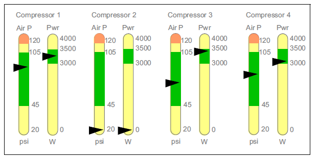
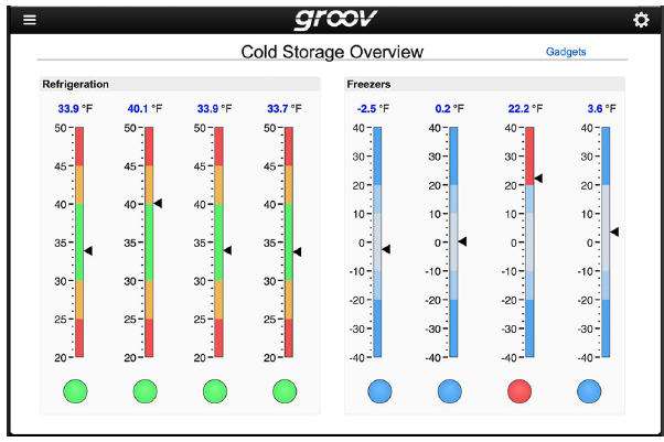
Has anyone created anything like the following (screenshots of analog style graphics from groov view) in PAC Display? I have been trying to make some using vertical height dynamic attributes, but it is not going very well.
I found this previous post for gauges using the rotational dynamic attributes (PAC Display examples - #29 by vmartysevich), if anyone has accomplished this using vertical, it would be very much appreciated!!
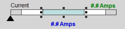
Yes that looks good! How do you get the triangle to show the current PV? Is it just a matter of using the horizontal position and and putting the movement left/right values as the width of the entire scale?
And are your white/grey boxes fixed or adjustable? - operators change alarm limits somewhat frequently (different run plans every week) so that is my main issue. I am trying to use the vertical size attribute but I’m missing something, I’ve been trying different combinations of the anchor points and min/max % height but I still can’t get it to look like that.
This graphic shows the same use of widgets in Philip’s reply. All the colored ranges can be changed with the sliders. I could reformat these samples to be vertical instead of horizontal.
Horizontal is fine! That looks very close to what I want to achieve - I am just still not 100% on HOW to do it though? Like those ranges and the transparent indicators, can you show me the exact set-up of the dynamic attributes? And/or what it looks like in PAC display configurator?
I jumped the gun a bit. My example is in groovView, which is more difficult to customize. In PAC Display it’s much easier. I’ll diagram a PAC Display example. I’ll need a bit more time to review my PAC Display project. I should have something for you this morning
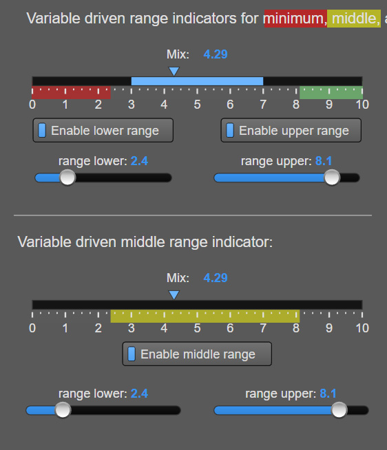
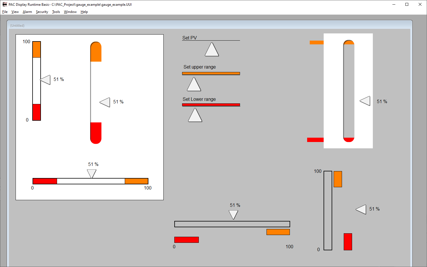
Here’s a screen shot a few gauges with range indicators. I’m checking with you to confirm that I’ve understood what you need. I can send my PAC Display project to you as well as the artwork used. (The only graphics drawn outside of PAC Display are the triangle indicators and the rectangle with the rounded cut out.)
Included in this view are exploded versions of the gauges so you can see the parts.
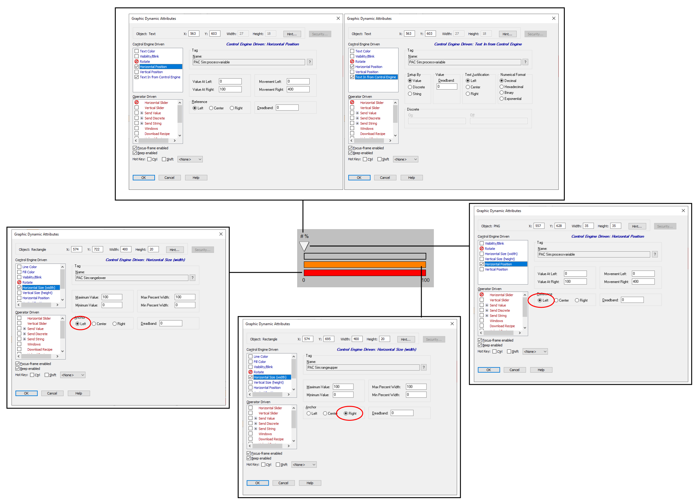
I’ll add notes on the dynamic attributes next.
Here the dynamic attribute dialog boxes showing how each graphical component is configured. I use three variables: process variable, range_lower, and range_upper. For vertical gauges, the settings for right and left would become top and bottom. Also, I chose to set the range from the right or from the top as a number counting down from the maximum. E.g., if your range is 80-100%, then I place a graphic on the right or top and set the value or range_upper to 20. The range indicators for the lower ends are more intuitive, e.g, 0-20 is shown by setting the value to 20.
It looks like John has you covered and his stuff looks great.
Yes, the triangle moves using the horizontal position attribute. The one I posted doesn’t change the box sizes.
If your operators are changing the limits and it isn’t a simple 0-100% scenario, then you may find it easiest to add logic in your strategy to map the engineering units to a 0-100 scale so you don’t have to modify PAC Display when the limits change.