Hey all you groov fans and page Builders…
Have you ever wanted to try your “Handheld” layout in groov View without actually having your mobile device handy or connected? You’re in luck! Both Chrome and Firefox have options for letting you simulate darn near any size device – including that fancy new one your boss has but you don’t!
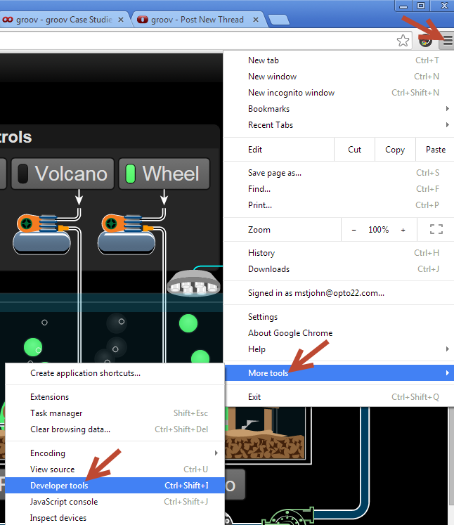
In Chrome, just click on the little menu (aka “hamburger” aka “triple equals”) icon in the top right corner, then select More Tools > Developer tools:
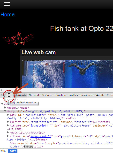
Then when the developer stuff appears at the bottom of the window, click on the Toggle device mode icon…
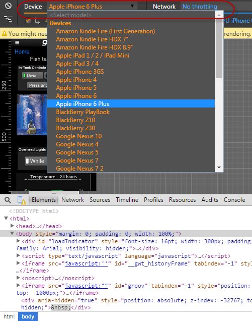
Then you can see a whole list of devices to try, and even how fast a Network your simulated mobile device is using! Note: you may need to refresh (e.g. F5) to pull down the correct “responsive” page from your groov (or any other web page you want to see on a different device).
But maybe you prefer a different browser, like…
FIREFOX! Check out the new pretty Blue Dog! (Happy 10th Birthday to Firefox.)
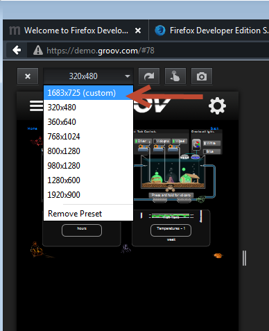
Similarly, if you look under tools there’s a Responsive Design View:

… which gives you options to see what your page would look like on any size device you like:
Happy page building and testing!
-OptoMary