Groov View Screen Layout

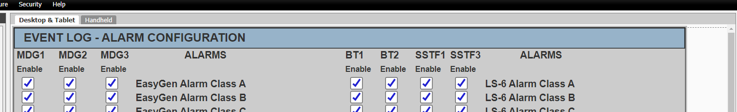
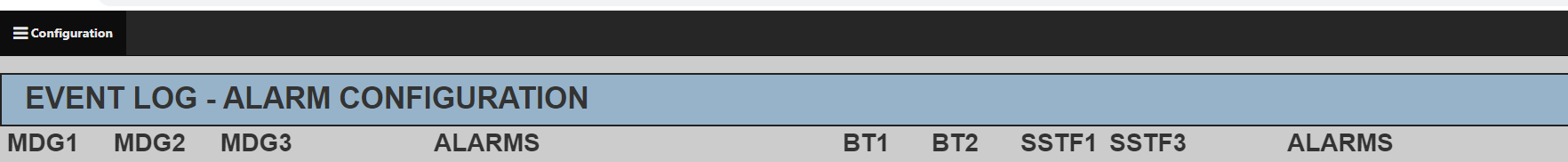
I was wondering if anyone else has noticed this. In Groov build when I place a rectangle box at the top of the screen and run it in groov view there seems to be a space above it as shown below. If the page is scrollable you can move it up to the menu bar. Seems like a little bit of wasted space I can’t use. Is there something I’m missing? The blue rectangle can’t be moved any higher in build.

Here it is in groov build:

And here it is in groov view:

Gary

That’s deliberate: there’s 20 pixels of padding between the top navigation bar and where the page starts rendering. I don’t remember the exact reasoning, but it’s always been there.

Since it is easy to increase the size of a page, and because it scrolls easy, I don’t think of it as wasted space. I would rather have it predictable on different devices, which it seems to be :slight_smile:

It’s not a big deal for me, I just never noticed it before.