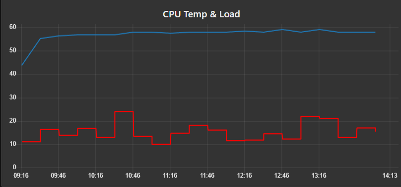
Here I am plotting the data from some of the points in this flow:
I booted things up this morning and its a 24 hour graph, you can see the RIO heat up and settle in the office.
Anyway, point is, it would be pretty easy to add a PID chart if that’s what you needed… or a sparkline.