Resizing Gadgets in Groov Build

Can someone please explain the sizing of gadgets in Groov build to me? I’m not a graphics guy but I’m trying as hard as I can to understand how it works. Here’s what I’ve done. I have 3 rectangles.

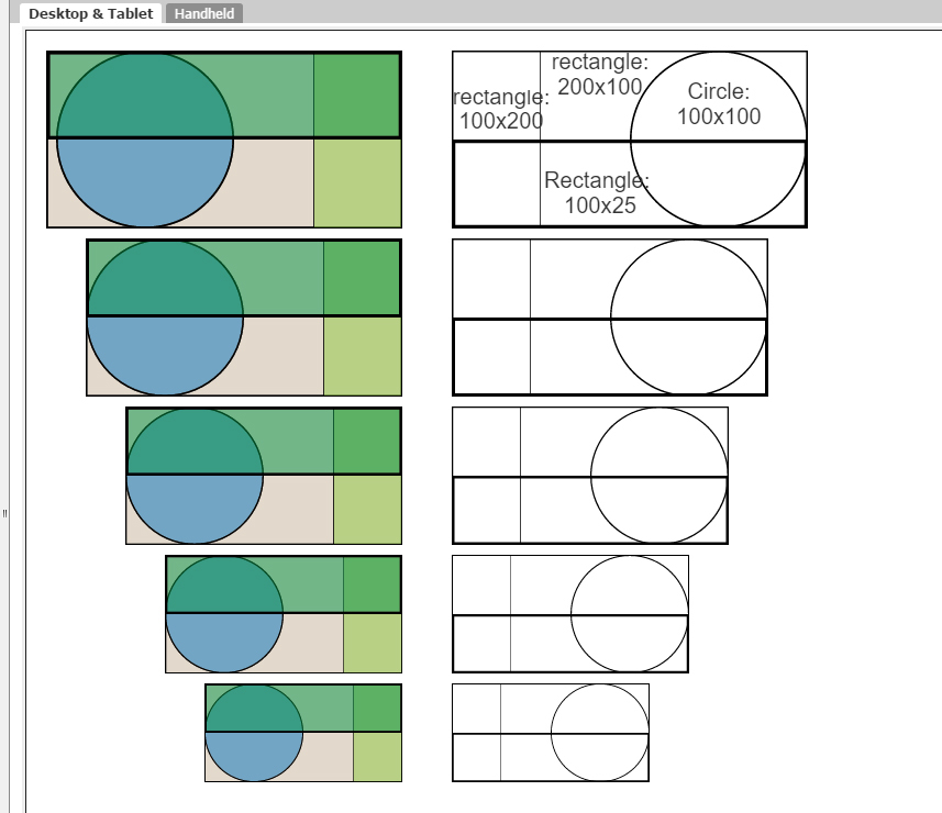
1: Rectangle 75 x 150 pixels. A .svg file
2. Rectangle 10 x20 pixels. a .svg file
3. Rectangle 50 x 10 pixels a .jpg file

The .svg files were created in Inkspace. The .jpg file in Paint.net

When I put them in Groov build they all come in on the grid a 24 x 48 grid elements (I don’t know what to call the little squares) and they all size down to 4 x 8 grid elements.

So what this seems to tell me is that no matter what size graphic I use, this is what I get. I would believe that except when I put a 250 x500 pixel .svg rectangle on the grid it’s so huge I can’t even resize it.

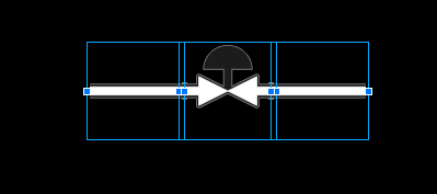
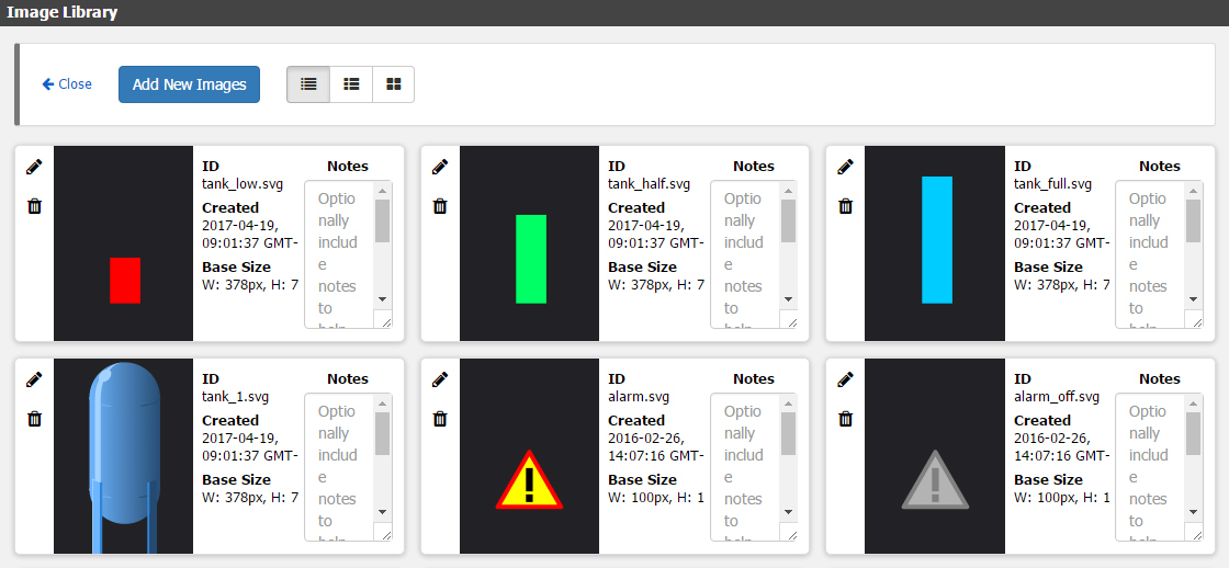
Just to add to the confusion, I took an image from the Groov SVG library to test. It’s a 100 x100 pixel image but the actual gadget is located inside that 100 x 100 rectangle and has some mystery size which allows it to be resized in 1/2 grid elements. How do I create THAT graphic?.

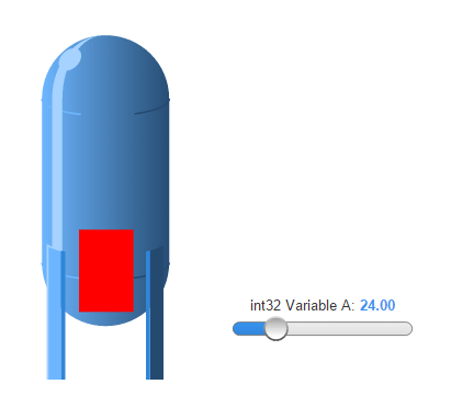
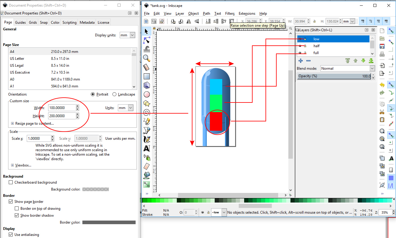
Can someone tell me the secret formula here? I just want to create a tank level type image indicator per this video (see below). Incredibly frustrating.

http://www.opto22.com/players/w_player.aspx?vid=p5xgtbbvac&pid=qxedes75pp&sec=0&vi=3

Thanks,

Dave

I would like this cleared up as well. I imported all the flow images (which look great, btw) into Inkscape. Then started laying out how I want my screen to look like. I even imported images from the Symbol Factory (which works great). Then I started saving the “pieces” so I can plug them into Groov and build my layout there. Only to find out 100X100 image isn’t the perfect size for Groov. So, some questions (desktop view):

  1. When you make an image indicator and add an .svg file, it has a Default Size… What is that pixel size?
  2. When you resize by gripping the handle of that image indicator to shrink it down… What does each stage represent in pixel size?
  3. What is the smallest square image that you can have if it was shrunk to the smallest that Groov Build will allow?
  4. When the image snaps to the “grid”, what part of the image snaps to the grid? Top left corner?
  5. When I arrow left, right, up or down with an image selected, how many pixels is it moving?

Below is a example picture of 3 separate images selected together in Groov. These started as 100x100 pixel images. The edges overlap. So, I’m just wanting to know what is the perfect size that will be universal for all projects going forward.

Edit: Never mind about the objects and them overlapping. I do see the handle is outside the image.

Thanks,
Dan

Hi Dan and Dave,
You two raise a lot of questions here, and I’ll try to answer all of them, but let me start with an example that I think addresses what you are trying to do. This is an illustration of me operating my tank in groov view. As I drag the slider, my tank level image changes.

I built the graphics in this tank level indicator using Inkscape:

The above graphic shows the important editing features. On the left is a window that controls the page size. This is very important. Any graphics that you want to line up should be exported from the same dimension page.

On the far right is a partial view of the layers feature. Unfortunately, I couldn’t find a way of resizing the view of my layers, but there are 4. The bottom layer contains a tank image that I downloaded from the groov.com SVG Image Library. Then, I created new layers, each containing a colored box of different sizes and colors. (Sizes, colors, and number of boxes is up to you.)

Then, I used the show/hide layer feature to show one layer at a time and did a “Save a copy” command. Ideally, you’d want to open each graphic and delete the hidden layers in order to cut down on file size, but I didn’t bother.

Then, I imported the 4 versions of the tank graphic into the groov build image library:

Notice that each of the first 4 graphics in the image library have the same dimensions. Now, they will all snap to the same space on the groov grid.

The tank became an image gadget with no interactive properties. On top of the tank, I put an image indicator gadget that comprised the three boxes.

jg

1 Like

Also, I didn’t explain the details of how to find the features in Inkscape and draw boxes and create layers, but if you have any questions, please ask.

I downloaded Inkscape a few weeks ago and it is an amazing image program. Especially when you want things perfectly drawn. I picked that up by seeing some other posts here. So glad I have it. I have been using an old, old program that actually is better at some things that Inkscape can/can’t do (…mainly, I can use Eye Candy 4000 as a plugin in my old program). Anyways, I’m fairly new to Inkscape, but I think I picked it up pretty good. Like anything else, there are always more to learn though.
Ok, so back to my previous 5 questions. All of those questions pertained to Groov Build. Do all 5 questions depend on what screen size you are using to “Build” in Groov Build? or is there a clear answer to those 5 questions?

The pixel size of gadgets in groov depends on the width of the browser window.

Pages in groov are 96 grid units wide in the Desktop & Tablet layout, and 32 units wide in the Handheld layout. Gadgets are constrained to that grid, using integer coordinates. So you can have a gadget at grid position (10, 14), that’s 13 units wide and 10 units tall.

To figure out how large that gadget will be drawn, and at what position, we first take the width of the browser window, minus a little bit of padding. (I don’t remember the exact padding at the moment.) Given that width, we divide it by the number of grid units for the current layout and round down to the nearest integer.

let gridSize = floor((viewportWidth - padding) / 96) (or 32 on mobile)
let pageWidth = gridSize * 96 (or 32)

For example, if your browser window is 800x600 pixels (and an arbitrary 10 pixel padding):

let gridSize = (800 - 10) / 96 = 8
let pageWidth = 8 * 96 = 768

The full width of the page will be 768 pixels, and each grid unit ends up being 8 pixels on a side. Pages are centered within the browser window, so the left edge of the page (where we begin drawing) ends up at (800 - 768) / 2 = 16 pixels from the edge of the browser window. Given our example gadget above, it’s upper left corner ends up at position (80, 112) within the page, so 80 + 16 = 96 pixels from the left edge of the browser window, and 112 pixels from the navigator bar at the top of the screen. It will be 104 pixels wide, and 80 pixels tall.

As you resize the browser, we recalculate gadget positions. We always round the grid unit size down to the nearest integer.

With that in mind, answering those 5 questions.

  1. An image indicator gadget defaults to 24x24 grid units. Once you attach an image to it, the default width stays at 24 grid units, and the height default changes to match your image’s aspect ratio.
  2. Each stage when resizing a gadget represents 1 grid unit. The pixel size depends on how wide your browser window is.
  3. The minimum grid width of an image gadget (or image indicator) is 4 grid units. Again, the resulting pixel width depends on how wide your browser is. I think we set a minimum viewport width of 320 pixels, so that comes out to 12 pixels wide on the desktop, 36 on mobile devices. (We don’t really support shrinking down the desktop view that much.)
  4. Top left corner.
  5. 1 grid unit per key press.
1 Like

Hi Dan,
I’m going to refer you to Jonathan’s comment regarding your specific questions. I’m working on another explanation of graphic sizes that I hope will be helpful.

This clarifies things. I appreciate the effort. I will keep this all in mind now when creating new .svg images.

Thank you,
Dan

I’ve created some graphics that show what you can do to make sure graphics you create will align. The important part is to make sure that the artboard, (total visible whitespace) is in dimensions that are divisible by 2. E.g., if you create a circle that is 1:1 (ratio, not pixels), a rectangle that is 2:1, a rectangle that is 1:2, and rectangle that is 4:1, you will be able to scale these objects so that they line up with each other. On the right side, I’ve rescaled the images so their edges align at various sizes.

I can get the exact same results if I use different pixel dimensions but with the same ratios, e.g., 100x100, 200x100, 100x200, and 100x25 (right column). The left images are 96x96, 96x192, 192x96, and 96x24 from the previous example.

Here’s another example: The road sections are the same height but the widths are 100px, 200px, 250px, 300px, and 400px. I’ve offset a second set to show the size of each graphic:

jg

2 Likes

Awesome. This is good stuff.
Thank you,
Dan

Indeed thank you. This is wonderful information. They should consider even sticky-ing this.

So how do you figure out the width of the browser window? Are you talking about the whole window, the Groov workspace, or something else?

I don’t have a hard answer for you (like x by y), but I do know that it really comes down to groov View, not groov Build.
Usually I have two browsers up, one in build, one in view, and I just save in one and then refresh the other.
Keeping in mind that it is ‘all about’ ratios, I can build a groov screen for pretty much any size device and have it look right.
The challenge we (Opto) are finding is that people are wanting to build to exact devices, rather than just scalelable screens for all devices. In this case, yes, its a bit trickier. Google the deployed device ratio/resolution and set up your groov View browser to be the same and build from there in the other browser.
When I have to do this, I often put a temporary vertical and horizontal line on my work space (in groov Build) so I know the end result boundaries.

Thanks Ben. What I really want to do is have my Inkscape pixel size match my deployed device so when I’m working in Inkscape and I save it, I can then just put it on my screen in Groov without having to resize it. Right now it comes into Groov at about 25% of what it should be. I then have to resize it and hope all the parts resize the same. Trying to figure out in Inkscape what the size should be is really tedious. I create the image, import it into Groov, see that it needs to be bigger or smaller, repeat the process… You get the idea.

So just to be clear, you are building for a specific device?

Yes. It’s an iPad and a phone but basically we’re using the iPad screen area for development and modifying the mobile part to match.

According to Google my browser size is 1248 x 775 and there is no padding. If you do an “Inspect” in the browser (Chrome) there’s a graphic which shows you all that stuff, and if you click on the view-able area it highlights my whole Groov View screen (see below). Based on Jonathan’s formula my grid unit would be 13 (1248/96). So in theory if my images were in multiples of 13 they would scale nicely? Am I correct in that?

Not exactly. At 1248 points, 1 unit on groov’s grid will equal 13 pixels, so you’ll want to use that to figure out how big your image will end up rendered. E.g. if you want it to take up a third of the page, you’ll have 32 units * 13 points = a 416 point wide image.

It’s not that it’ll scale nicely, exactly: as soon as you resize your browser window it’s going to introduce some scaling. But if you’re sure your browser will always be a fixed size, you can design your images so that they don’t scale at all at runtime.

Note: 1 point = 1 pixel on a normal display, but on a high DPI display like an iPhone, iPad or a Retina Mac, 1 point will be 2 or 3 pixels. If you want your images as sharp as possible, you’ll need to take that into account.

I’m sorry this isn’t more straightforward; groov was designed at the outset for scalable displays, not pixel-perfect ones.

I hesitate to say yes without knowing what you’re trying to draw. I find that it makes no difference if I use a 13-pixel grid or a 10-pixel grid. As long as my objects have height and width dimensions that have a common divisor, such as 10 or 13, they will align and I can resize individual elements and still get good alignment. Assume that the artboard (or background) is the same size as the object you draw. However, it’s easier to align objects with low integer ratios, eg., 1:1, 1:2, 1:3, 2:3, than with high integer ratios: 10:11, 5:6, 7:8.