hello,
I am trying to build a chart with some data from mysql database.
I have a query to the database and it returns a object with temperatures that I want to send to a chart and make a line chart. So that I can see the averrrage temperature of each month.
This is the output of the query:
   array[5]

    0: object
    avg(temp): 31.125
    the_month: 7

    1: object
    avg(temp): 29.9429
    the_month: 8

    2: object
    avg(temp): 30.6712
    the_month: 9

    3: object
    avg(temp): 31.5285
    the_month: 10

    4: object
    avg(temp): 30.5727
    the_month: 11
I am trying to do as the example in end of that github page you sent but no luck yet.
I wanted a chart like, in the x axis the month (“Jul”, “Aug”, “Sept”, “Oct”, “Nov”) and in the y axis the temperature.
So that the line would show the average temperature through the months.
The flow I have is this:
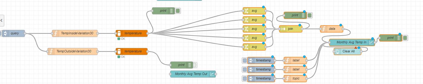
I have no output chart.
I know it is confusing but, I used those change flows to get the average from the object, there’s the average of each month and then join them in an array that I use in the function and send to the chart.
The label and topic flows I got from the example, but I don’t understand how they work.
The data function as the following code:
var m={
    "series":["X"],
    "data": msg.payload,
    "labels":["Jul","Aug","Sept", "Oct", "Nov"]
};
return {payload:[m]};
I receive the month and the respective average temperature. Ou is it possible to put it in a line chart?